BRANDING PROJECT
Lekestue
Lekestue is a small gem of a children’s store at the top of Grunerløkka. Here, you’ll find toys and furniture for children’s rooms. Creating a home with children and space for creative play doesn’t have to compromise on aesthetics.
The client wanted something fun and different, but it was important that the identity was linked to their other store,
@HOME Interior.
Solution
The owner of this shop wanted something quirky and fun, but related to their other shop @HOME Interiør. For that reason I decided to keep the house from the logo and incorporate it into this new design.
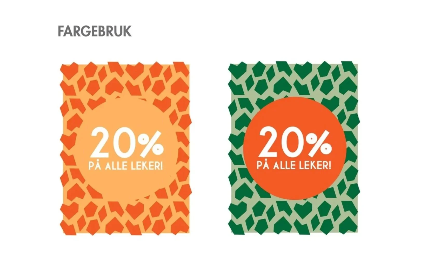
The branding was inspired by classic Norwegian children’s television—particularly the show Portveien 2 which featured a giraffe mascot—to evoke a nostalgic, playful atmosphere. To add to the branding I developed a pattern derived from the giraffe spots that would be used as design assets for posters, marketing materials and window decals.
Client
Lekestue
Year
2018