ALBUM COVER DESIGN
Batavia
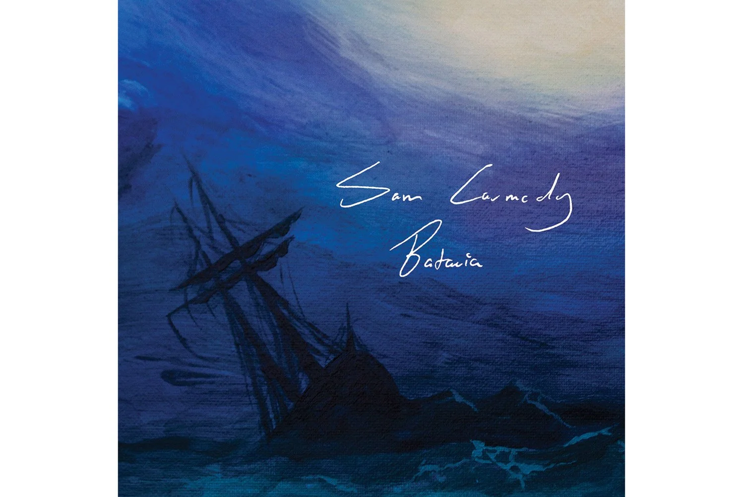
Batavia is a single of singer-songwriter Sam Carmody. As Sam and I have worked successfully together in multiple projects before, I was happy to do this artwork for him as a solo artist.
Both Sam and I wanted to do something painted for this cover, and quite early on agreed on a stormy seascape. Inspired by 1700s-painter William Turner, we wanted a composition that played with both light and darkness.
Batavia was ship that sank outside of Western Australia in the 1700s, and this song depicts a sailors final song to his lover waiting in a harbour that he will never see again, as his ship sinks beneath the waves. The song is also about the depths of depression and the deliberating effect it has on you.
Solution
The painting was done in acrylics on a fabric canvas, then photographed and retouched digitally. I first sketched out the composition digitally before painting, and tried to use thin layers watered down with solution to make the ship look hazy and lost. The first rendition of the art had a figure in the foreground watching the ship go down, but during the editing process the figure was cropped out to fully focus on the sinking ship.
As this is a quite personal song for Sam, it felt appropriate to use a trace of Sam’s actual handwriting for the album title typography.
Client
Sam Carmody
Year
2020